
HORSEMANSHIP
it is not just a way to train a horse but it is
everything we do
with our horses and in our own lives.
UPCOMING EVENTS
March 27 - 28, 2026
Horse Professional Business Mastermind & Workshop Intensive
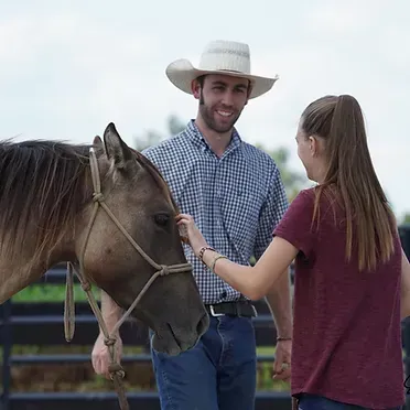
Welcome to Colton Woods Horsemanship. Around here, we keep it fun, we keep it informative, we keep it real, and we keep it positive. Our mission is to Educate Horses and People With a Lifetime in Mind, because how we get the job done is our priority, regardless of discipline. With the ‘How’ at the forefront, there is no limit to ‘What’ we can do to help you and your horse
BE THE Best You THAT You CAN BE.
serving you and your horse through
CAREER
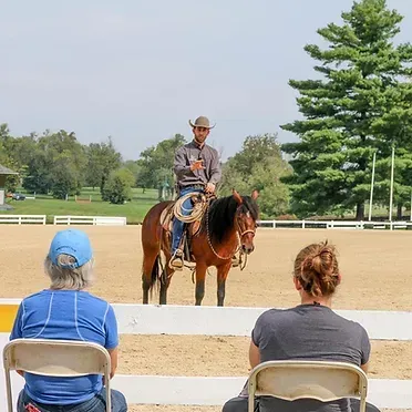
CLINICS
VIDEOS
TRAINING
PODCAST
WHAT OTHERS ARE SAYING
Redefining What It Means to be a Horse Trainer
WE ARE PROUD TO OFFER PROGRAMS SPECIFICALLY DESIGNED TO DEVELOP AND SUPPORT EQUESTRIAN PROFESSIONALS
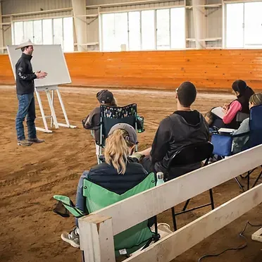
The Professional Horseman's School
Turn your dream into your profession as a Qualified and Certified Professional Horseman.
Professional Mentorship Program
Build a horse training business that works for you, not the other way around with the group mentorship program for established equestrian professionals.
The Business Course for Horse Trainers
Start or grow a highly successful horse training business in less than 60 days with our 12-week online course.
HAND-SELECTED PRODUCTS THAT
WE USE, BELIEVE IN AND KNOW
Make a Difference
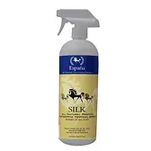
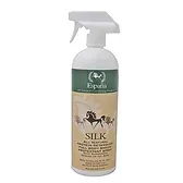
Espana SILK All Natural Protein Antiseptic Topical Spray (1L)
$28.00
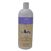
Espana SILK All Natural Protein Detangler (1L)
$28.00
Espana SILK All Natural Protein Whitening and Brightening Shampoo (1L)
$28.00
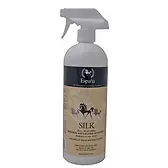
Espana SILK All Natural Protein Waterless Shampoo (1L)
$28.00
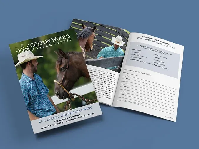
Build a partnership for a lifetime with your horse!
Download the FREE guide to Be a Leader Worth Following

Educating Horses and People with a Lifetime in Mind
©2026 Colton Woods Horsemanship. | Privacy Policy | Terms & Conditions